State of the City 2024 — People · Projects · Results
Designing an annual address around the people it was written for.
A multi-channel event built around three words: People. Projects. Results.
Snapshot.
CLIENT
City of Albany, NY — Mayor’s Office
ROLE
Creative direction, event branding, visual system, collateral, presentation, website & livestream assets, environmental graphics, video story framework
EVENT
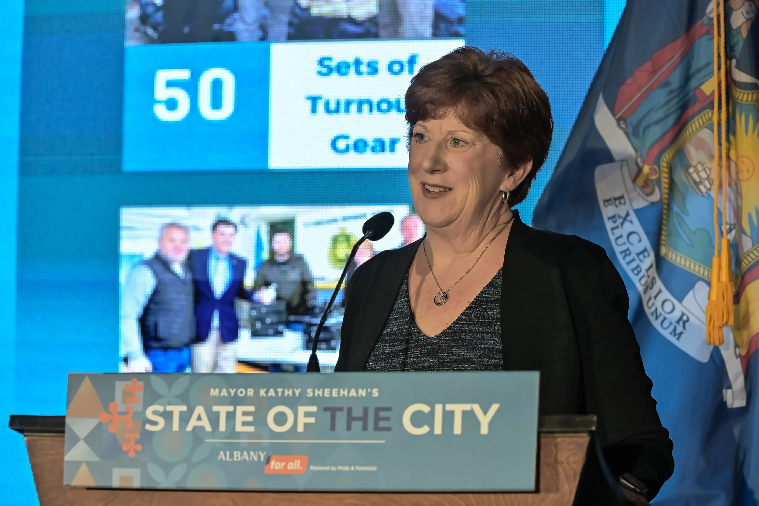
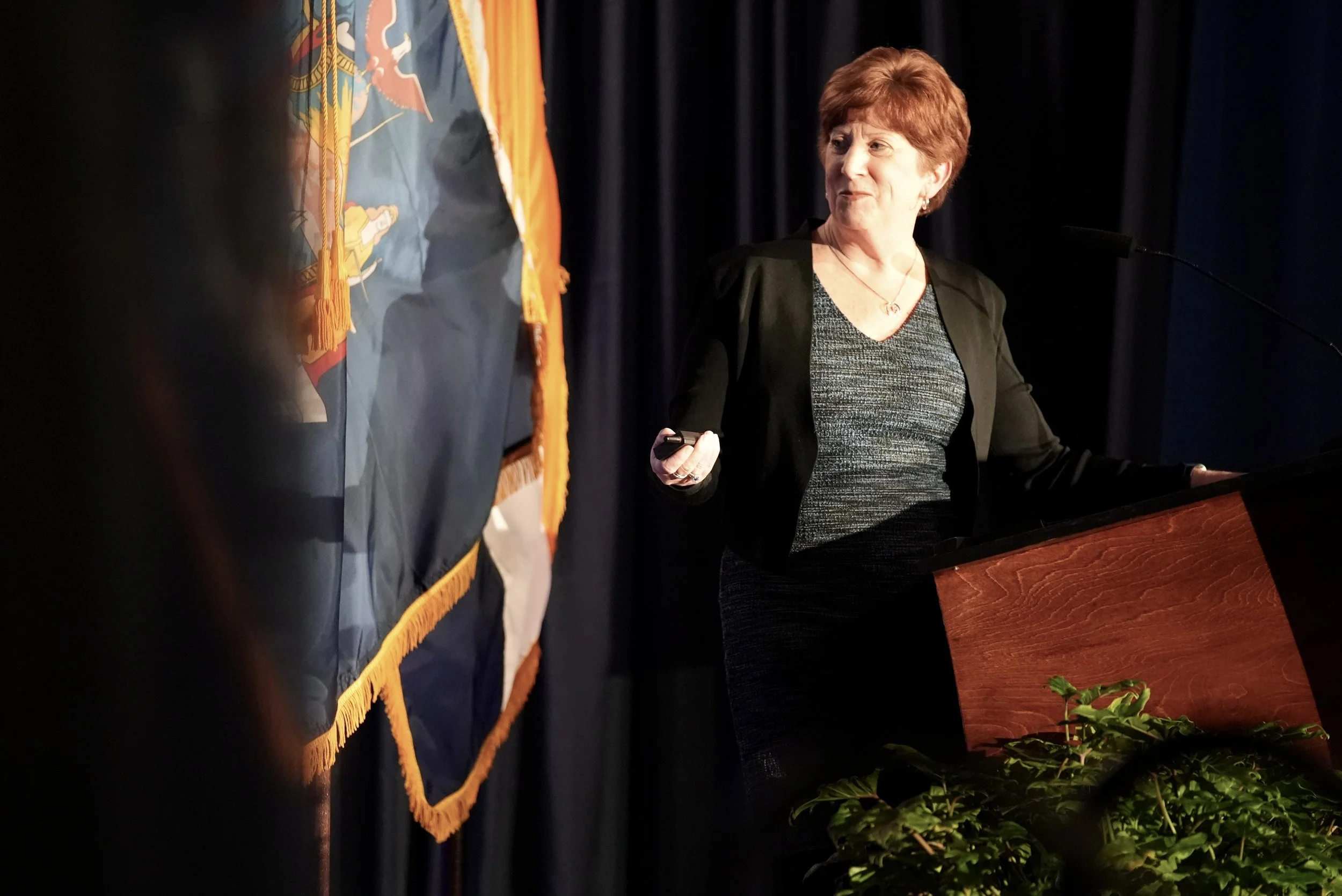
Mayor Kathy Sheehan’s State of the City 2024
THEME
People · Projects · Results
Can federal funding become a human story?
The 2024 State of the City wasn’t meant to be a list of completed projects. The Mayor’s directive was clear: show that ARPA dollars translated into real, tangible results for real residents.
My task was to turn a federal recovery program into a human story — one that residents could recognize themselves in.
Instead of highlighting funding streams or policy language, I built the entire visual system around people whose lives intersected with ARPA investments: small business owners who expanded, families who gained housing stability, seniors and youth who benefited from new programs, and neighborhoods transformed by infrastructure and recreation improvements.
Every portrait, every title card, every slide, and every piece of collateral pointed back to one narrative:
ARPA wasn’t abstract. It showed up for Albany — in faces, families, and futures.
This became the foundation for the theme People · Projects · Results, grounding federal dollars in lived experience and giving residents a clear, accessible way to see what recovery looked like in their own city.
One cohesive story
From one speech to a full visual ecosystem
For State of the City 2024, I created a connected system that lived across:
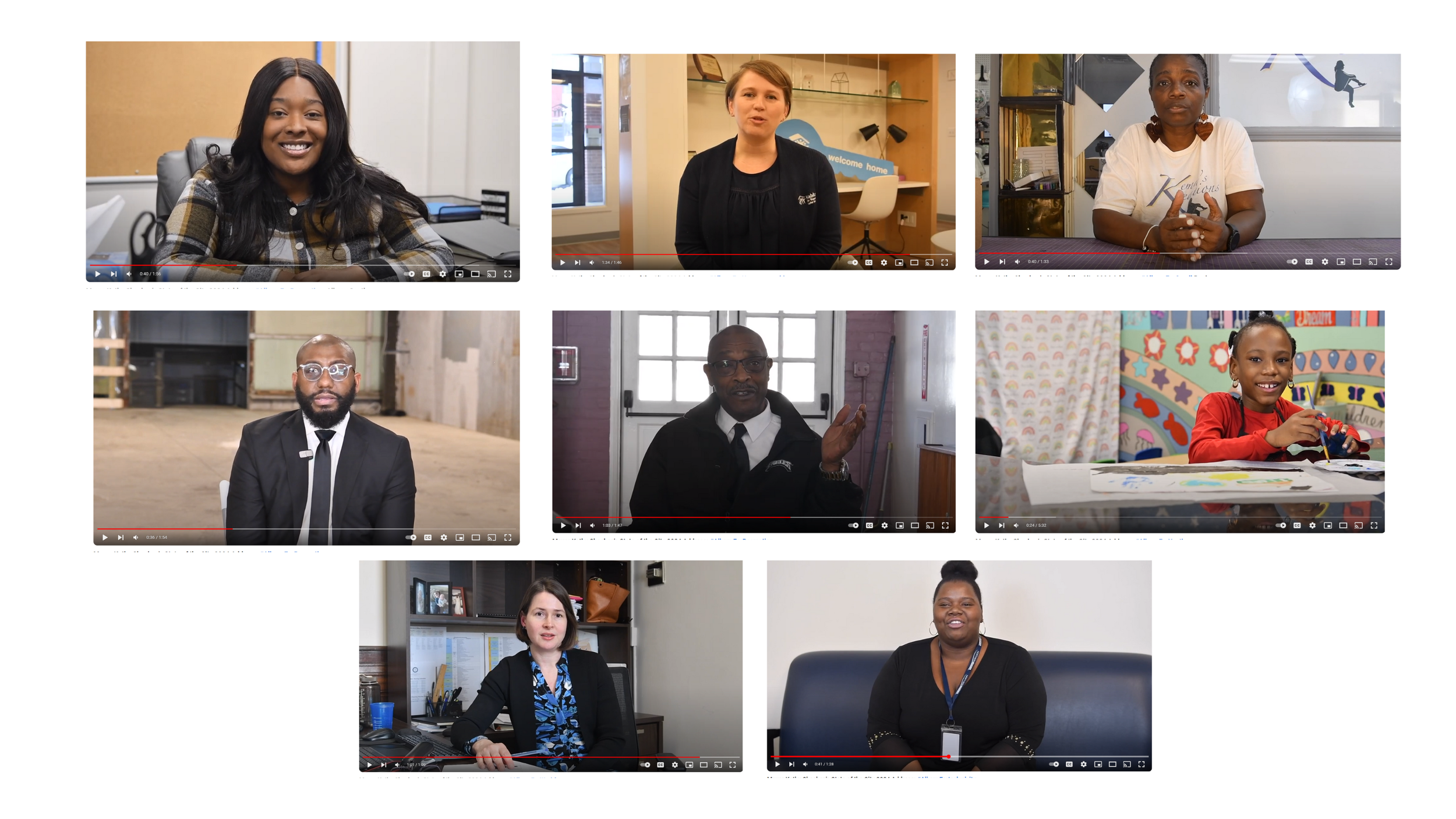
Portrait series & interviews
Keynote presentation & livestream package
Event website hub
Program book & 11x17 insert
Ceiling & building signage
Supporting video story moments PORTFOLIO SOTC 24
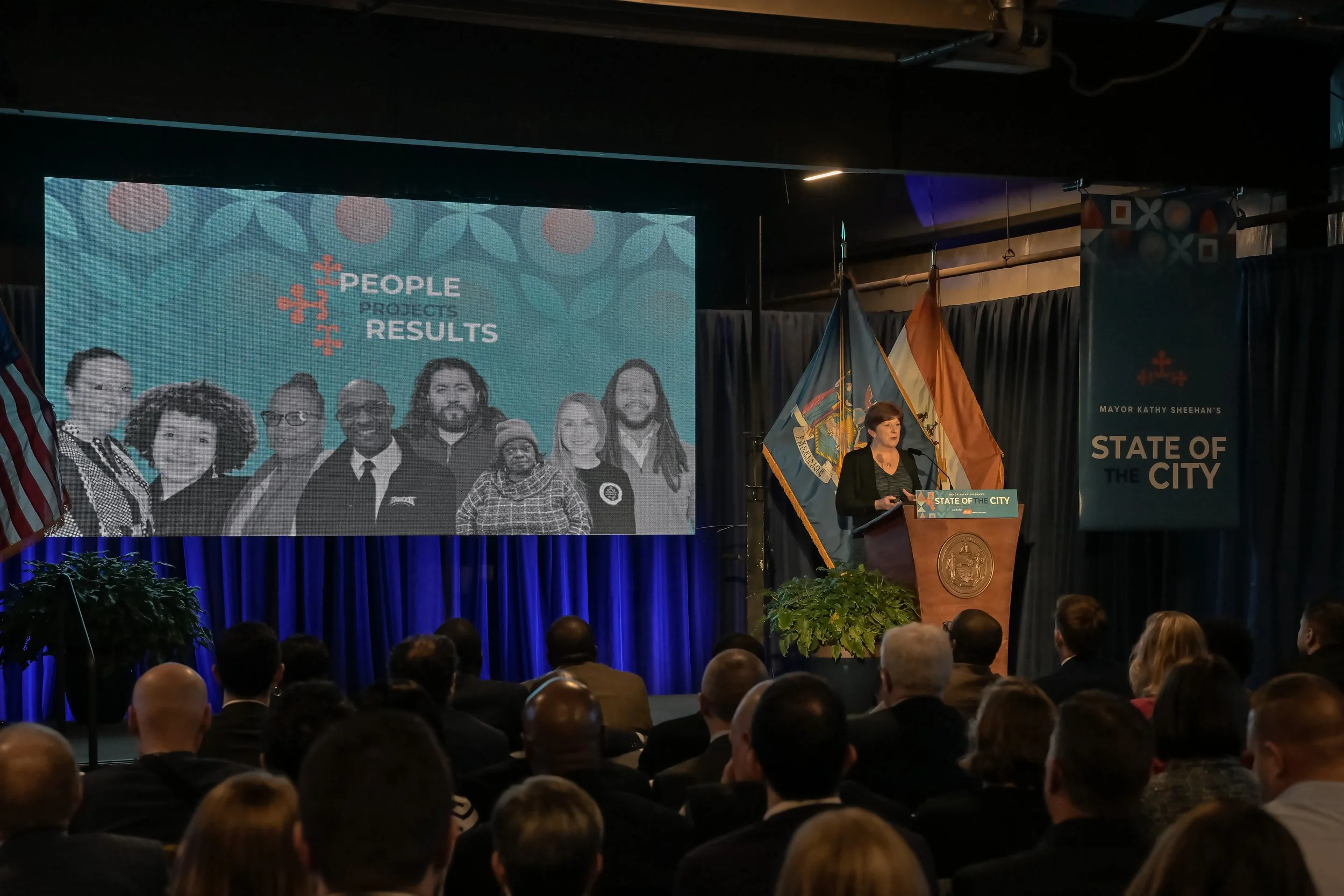
Each element carried the same graphic language — tiled motifs, bold color, and black-and-white portraits — so that no matter where you encountered the event, it felt like one coherent story.
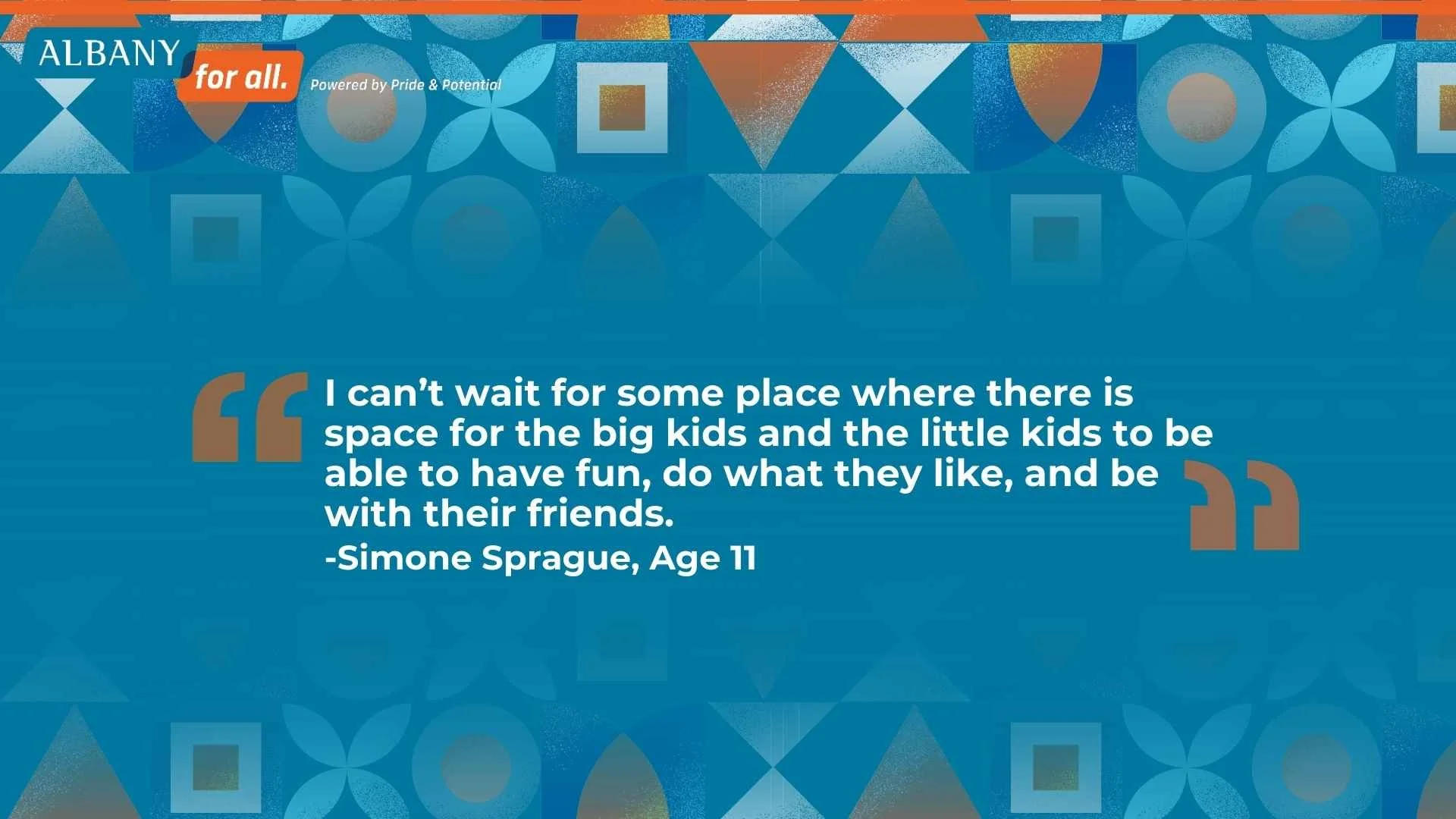
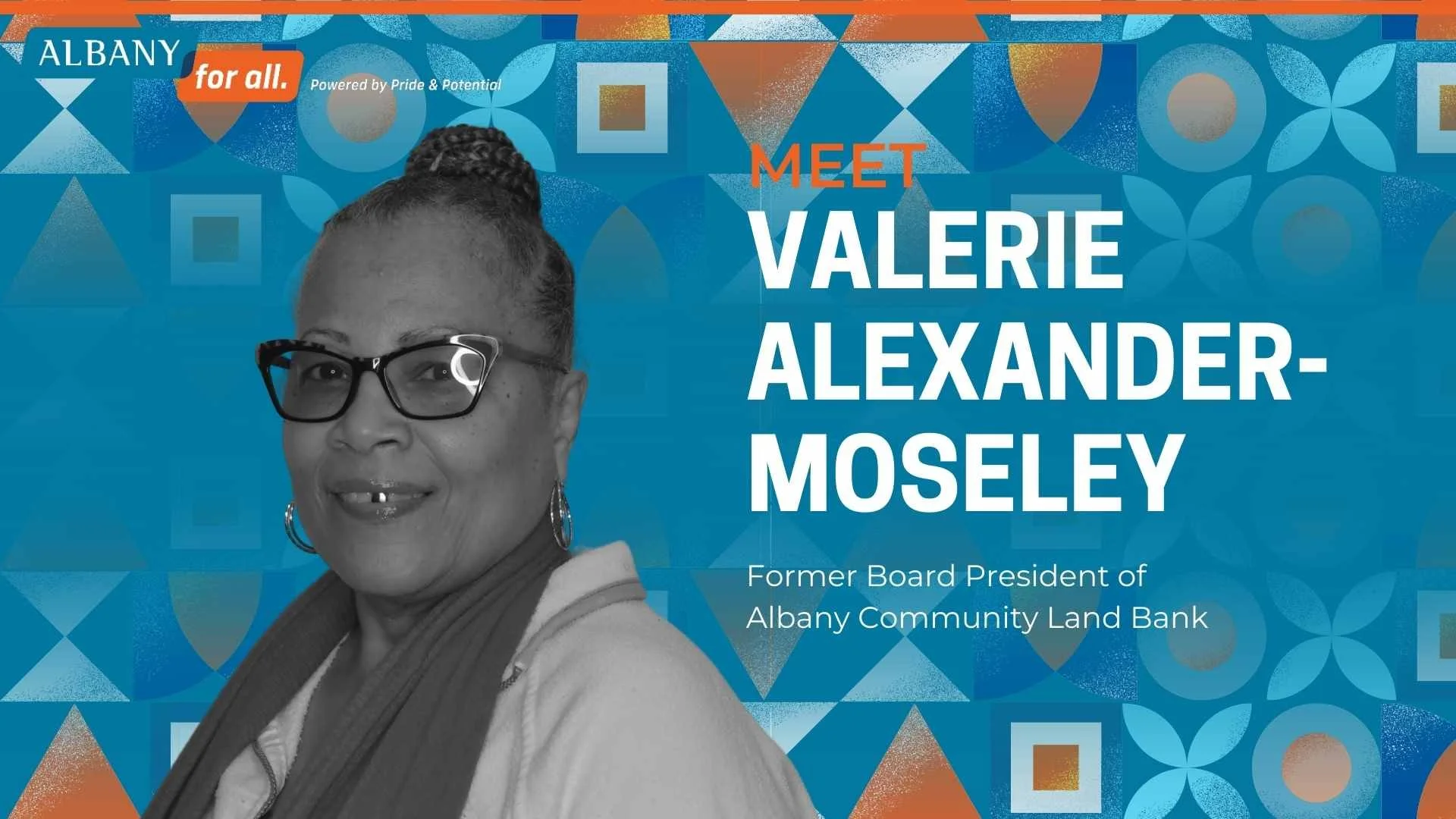
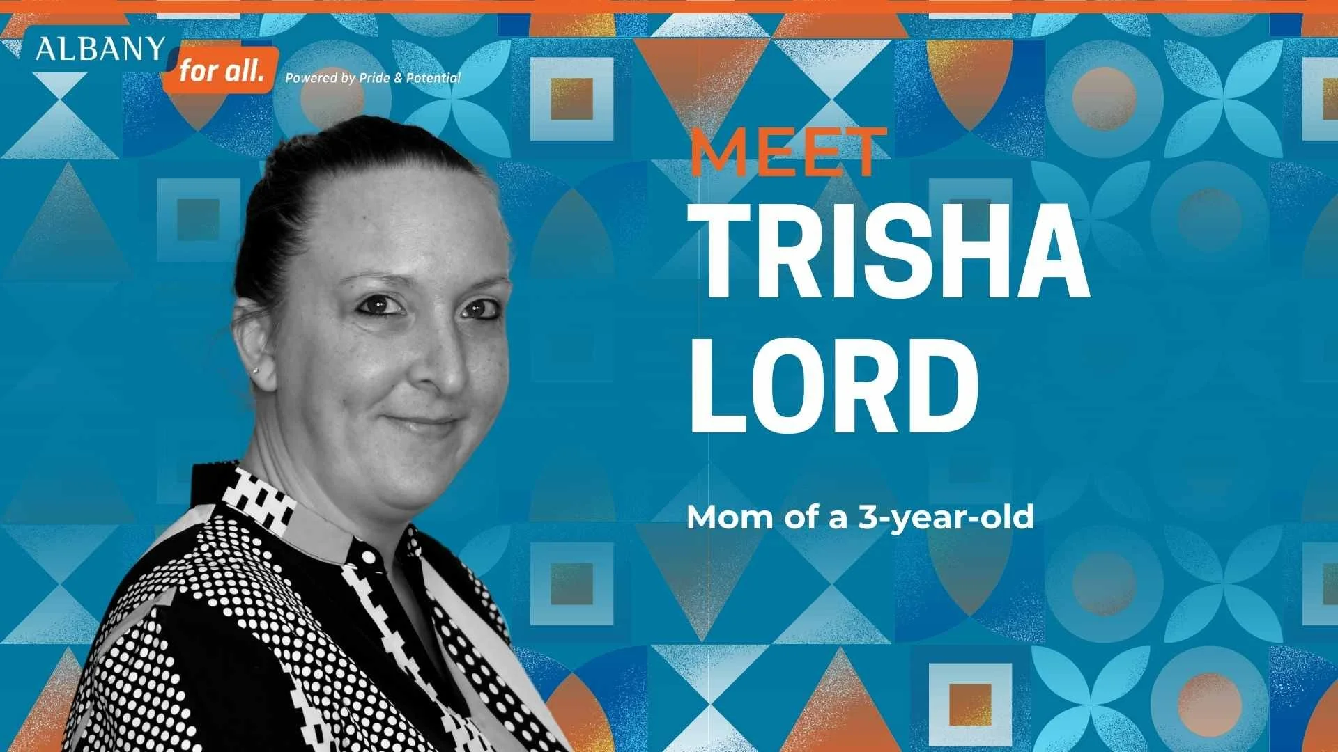
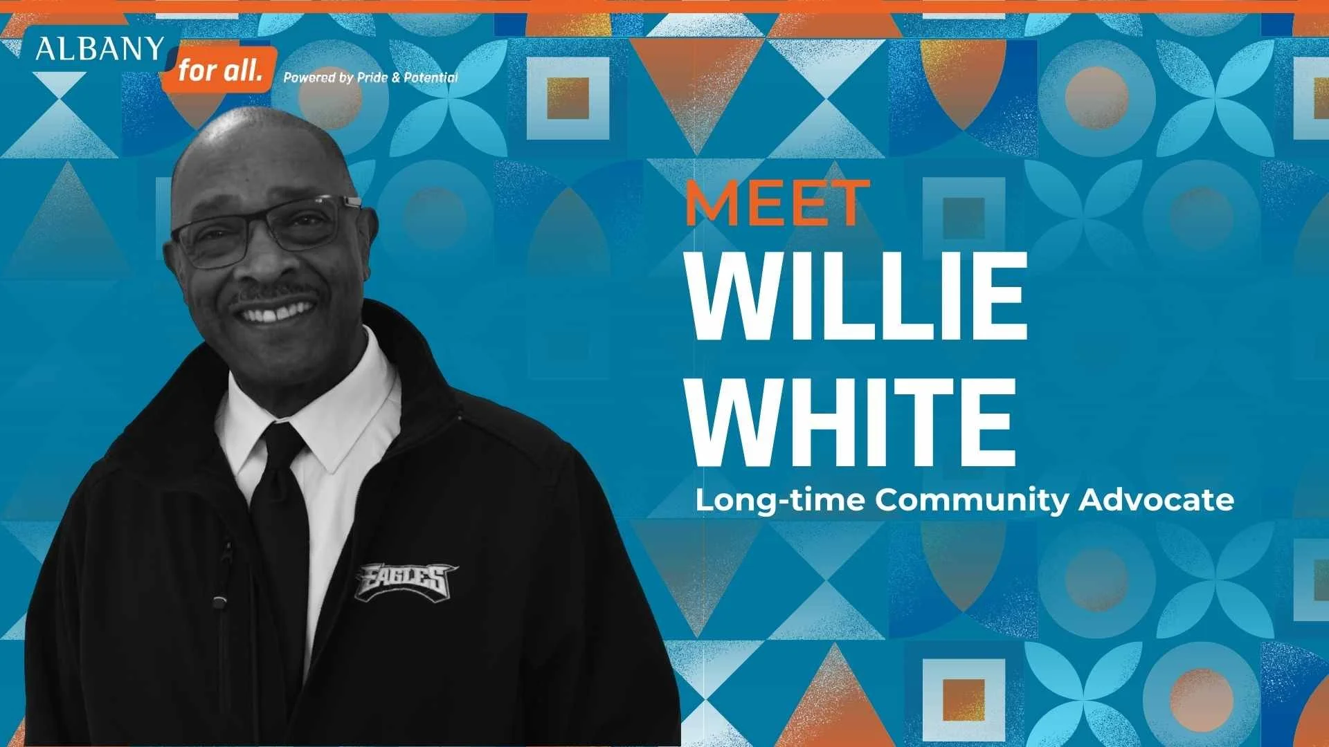
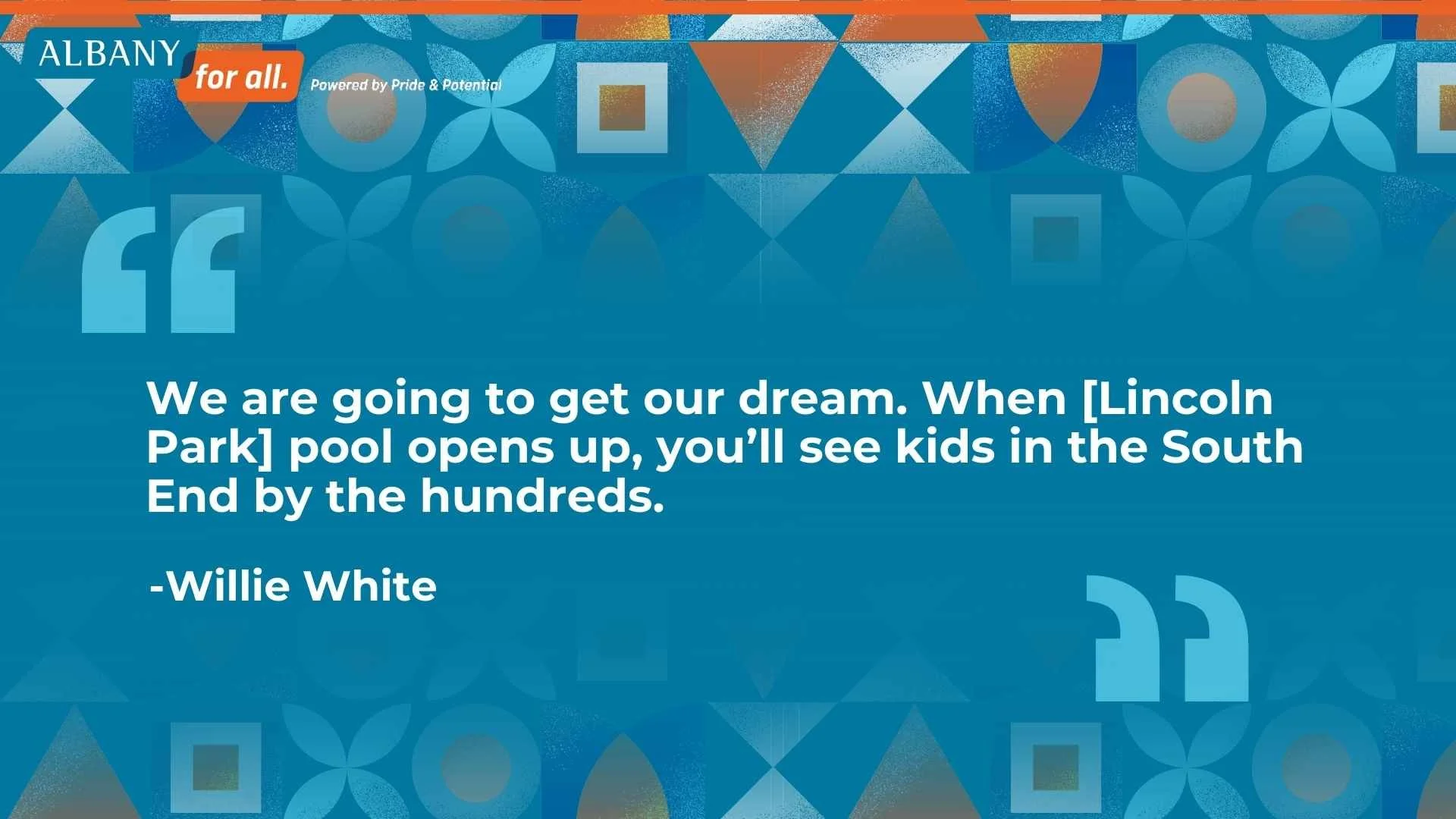
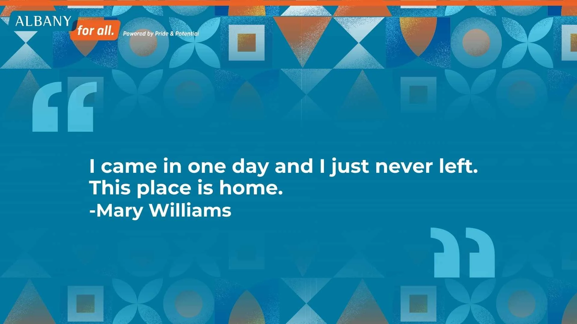
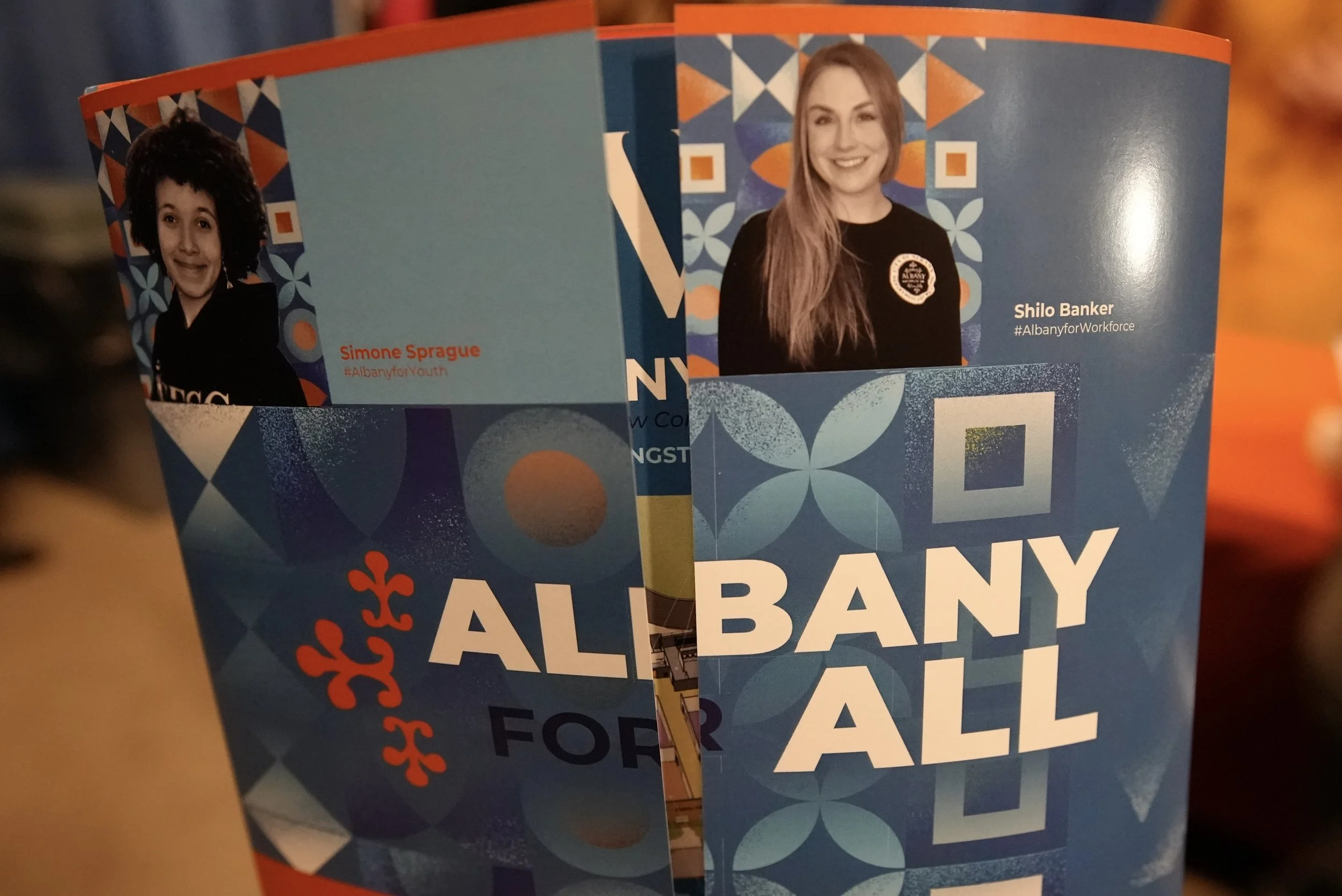
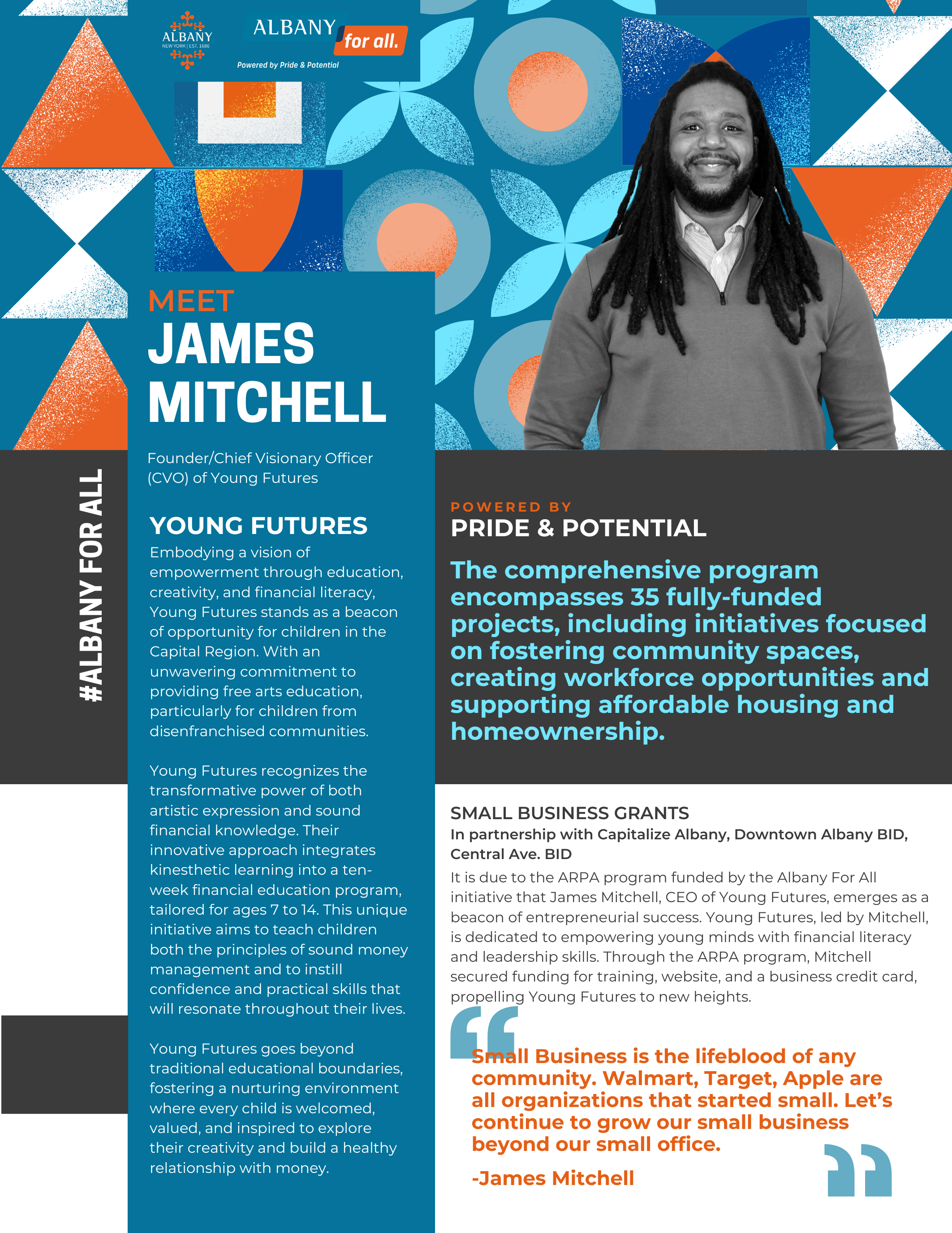
People.
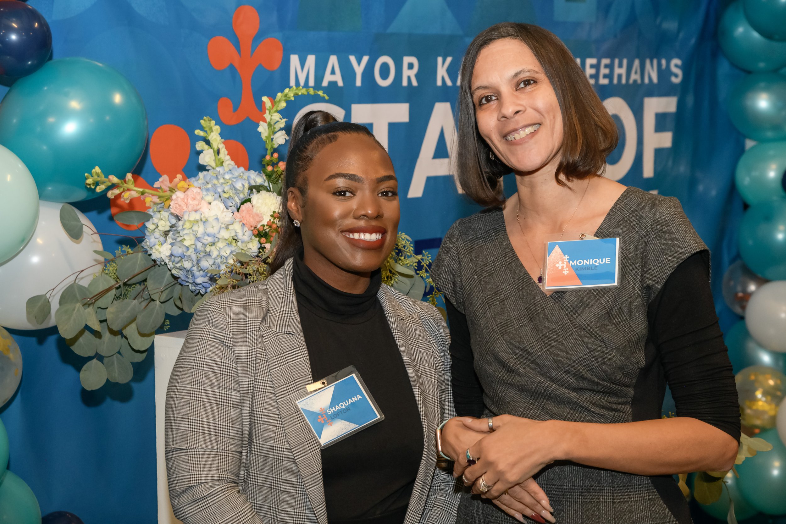
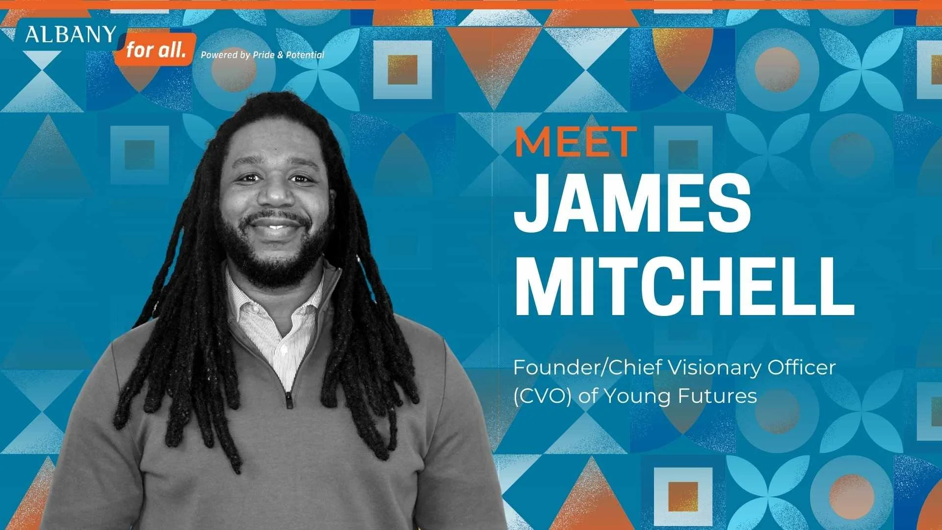
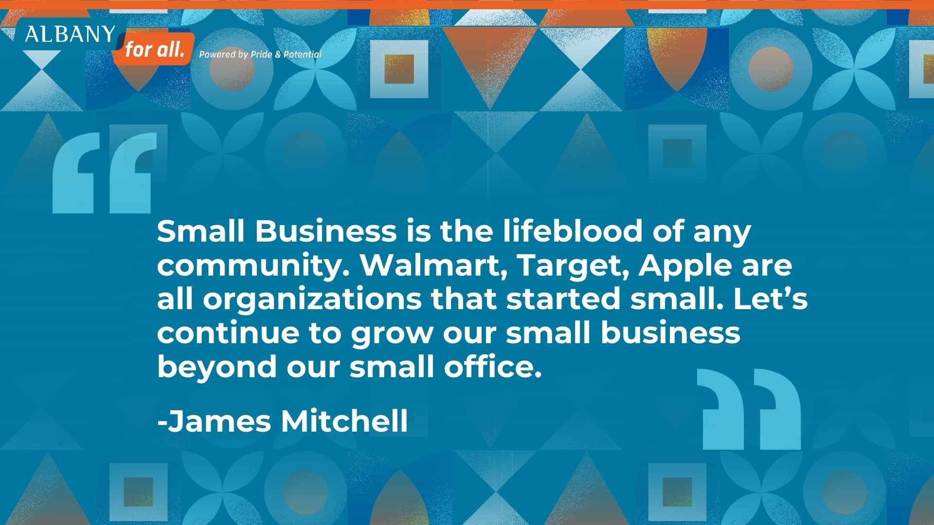
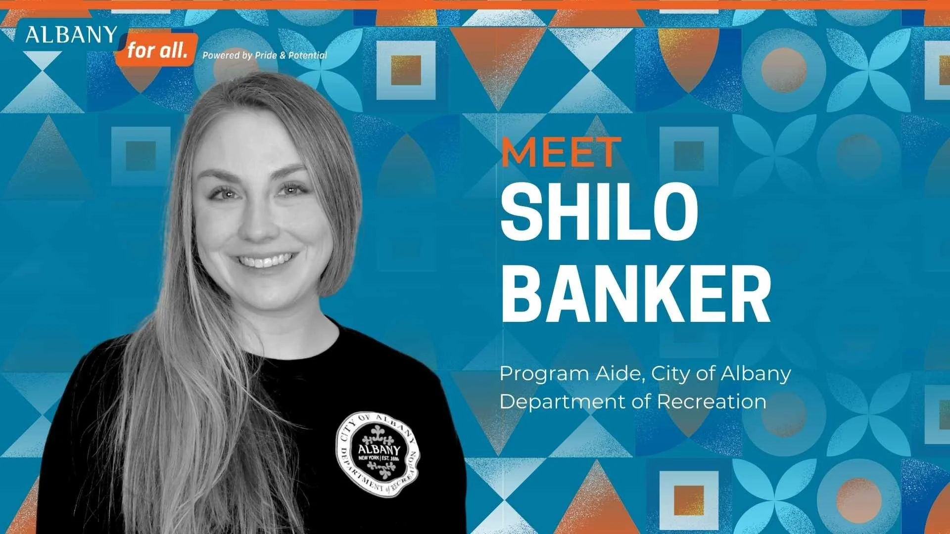
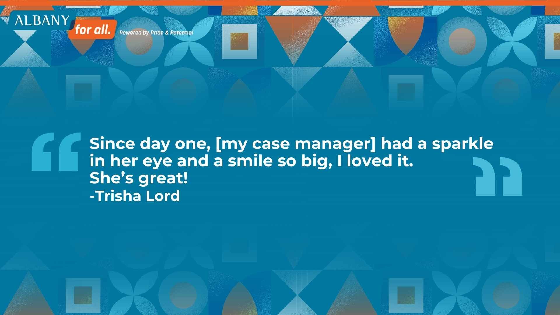
I developed a portrait series that introduced seven residents and partners, each paired with a line that completed the phrase “Albany for…”
These portraits appeared:
On screen during the event
In the program book and other materials
On the website and digital promotions
Within a dedicated “Interview”


Projects.
I designed the full slide package for the keynote, ensuring it worked both in-person and on livestream:
Clear, bold stats for public safety, housing, workforce, and youth outcomes
Project visuals for major capital investments and neighborhood work
Integrated photo moments that tied back to the portrait series
The same design language extended to the livestream graphics, lower thirds, and title frames, creating a consistent experience no matter where you watched.
RESULTS.
Website
I designed the visual assets for the City’s State of the City 2024 webpage, including:
Hero banner
“View Photos” and “Watch Here” buttons
Page layout that reused the SOTC 2024 branding and portrait photography PORTFOLIO SOTC 24
The page became the central hub where residents could:
Rewatch the address
Browse photos
Read the full written State of the City

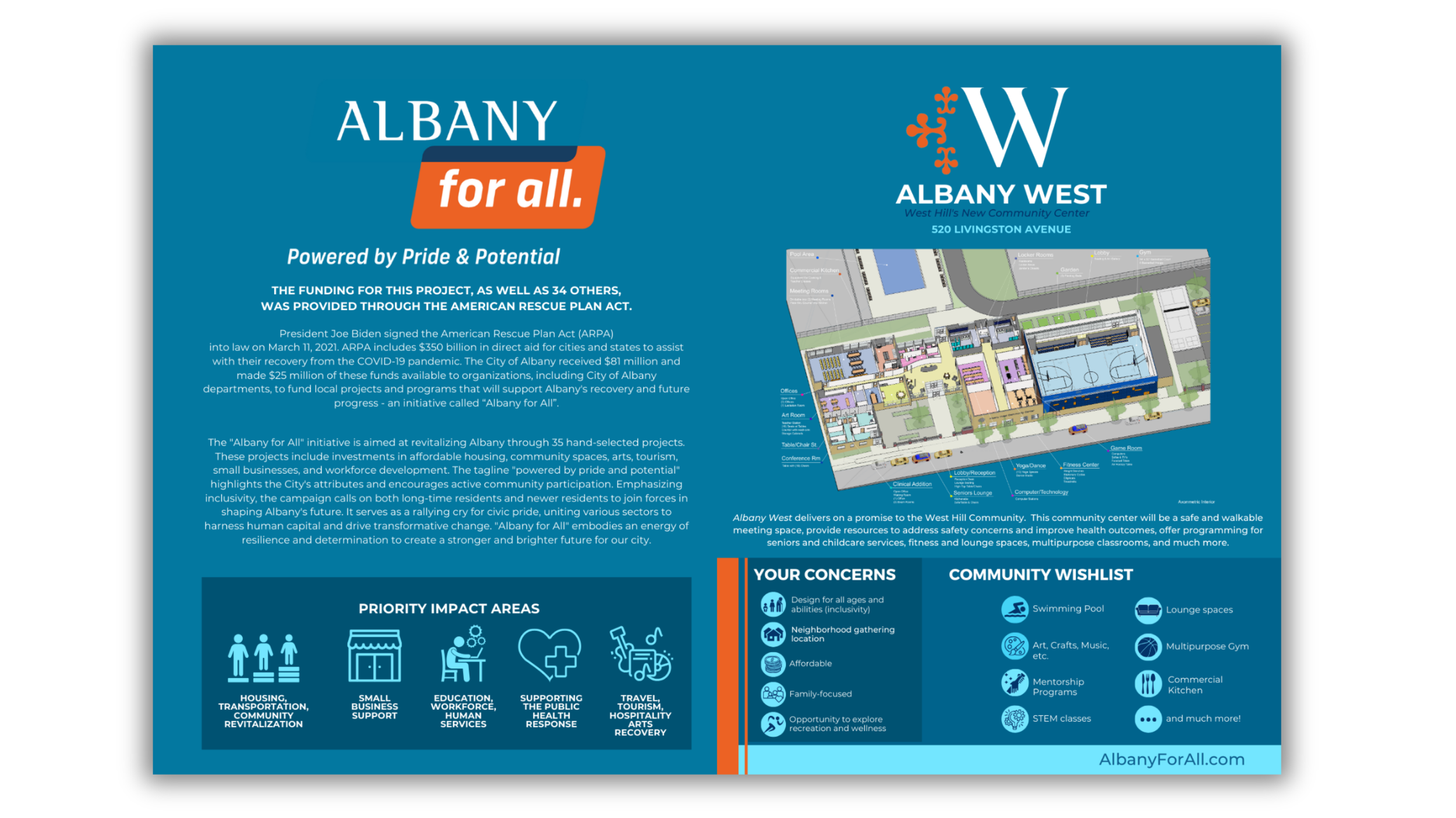
Program Book and Insert

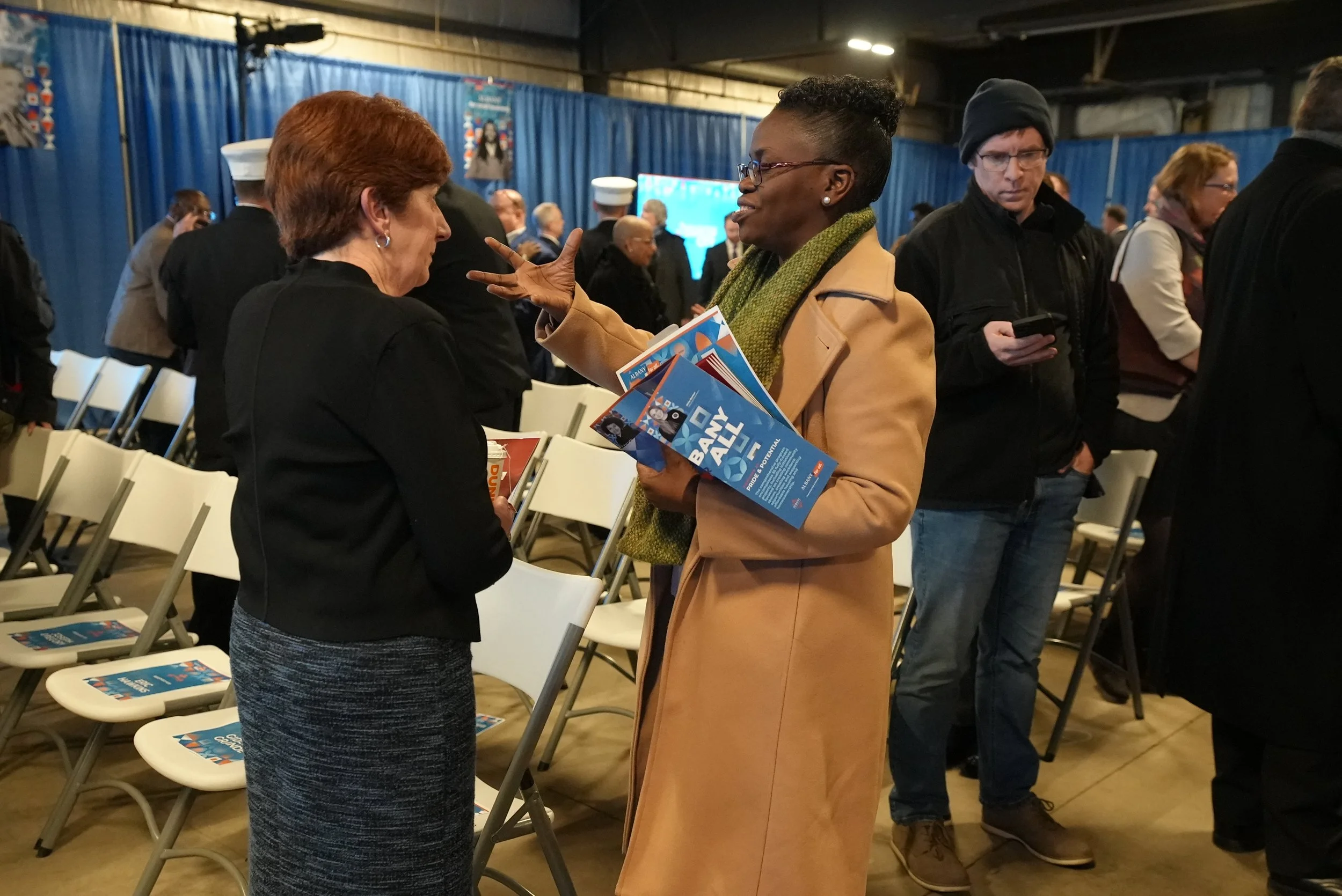
To extend the story beyond the room, I created:
A program book that combined theme visuals, resident portraits, and key message framing PORTFOLIO SOTC 24
An 11x17 insert, folded to 8.5x11, that focused on Albany West and community impact basics — designed to be both a handout and a reference sheet after the event PORTFOLIO SOTC 24
These pieces let attendees leave with more than a memory — they left with something they could point to, share, and revisit.
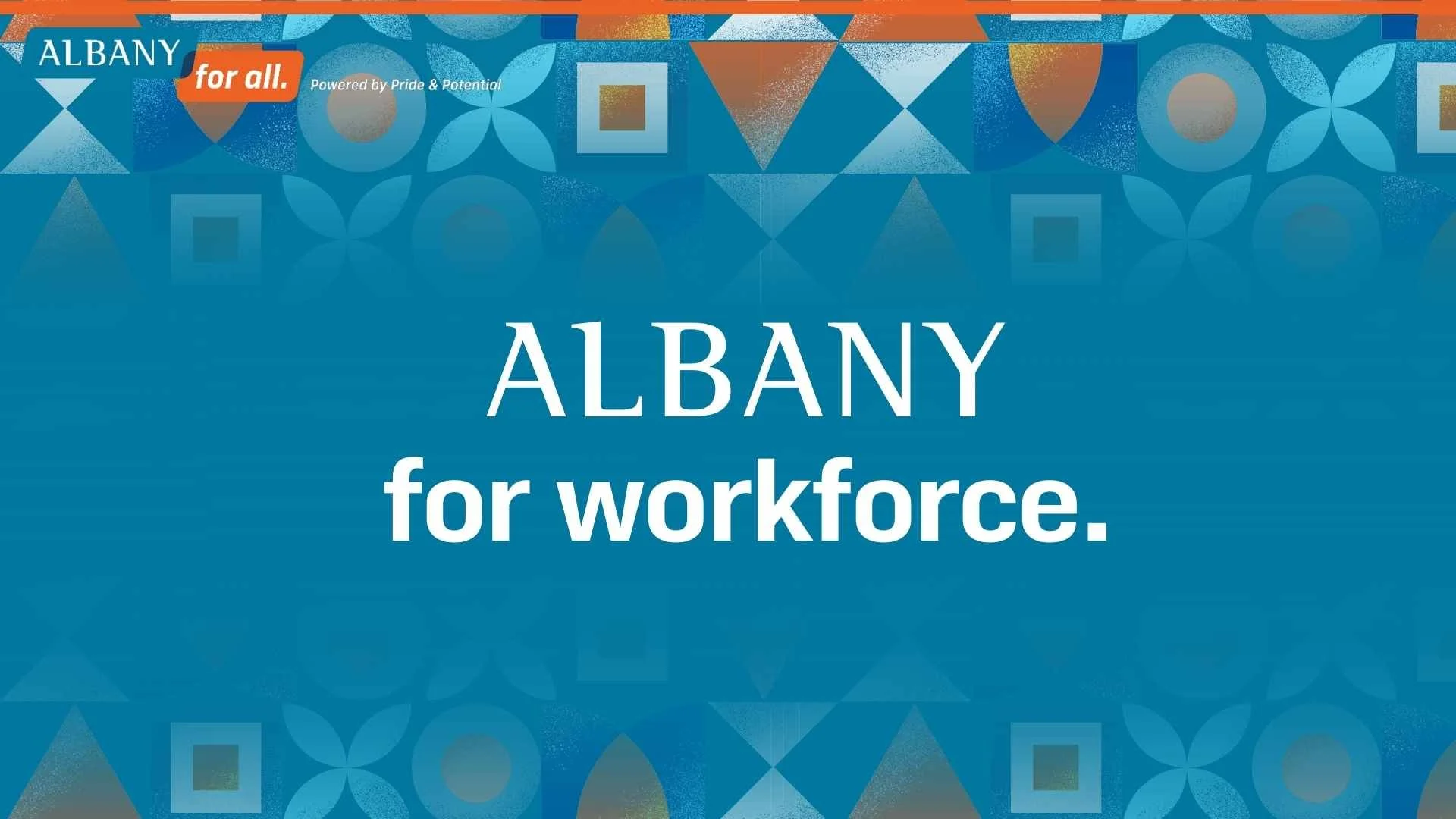
Albany For Small Business

Albany For Workforce

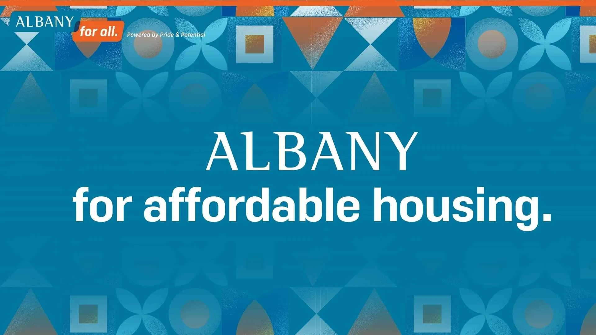
Albany For Affordable Housing
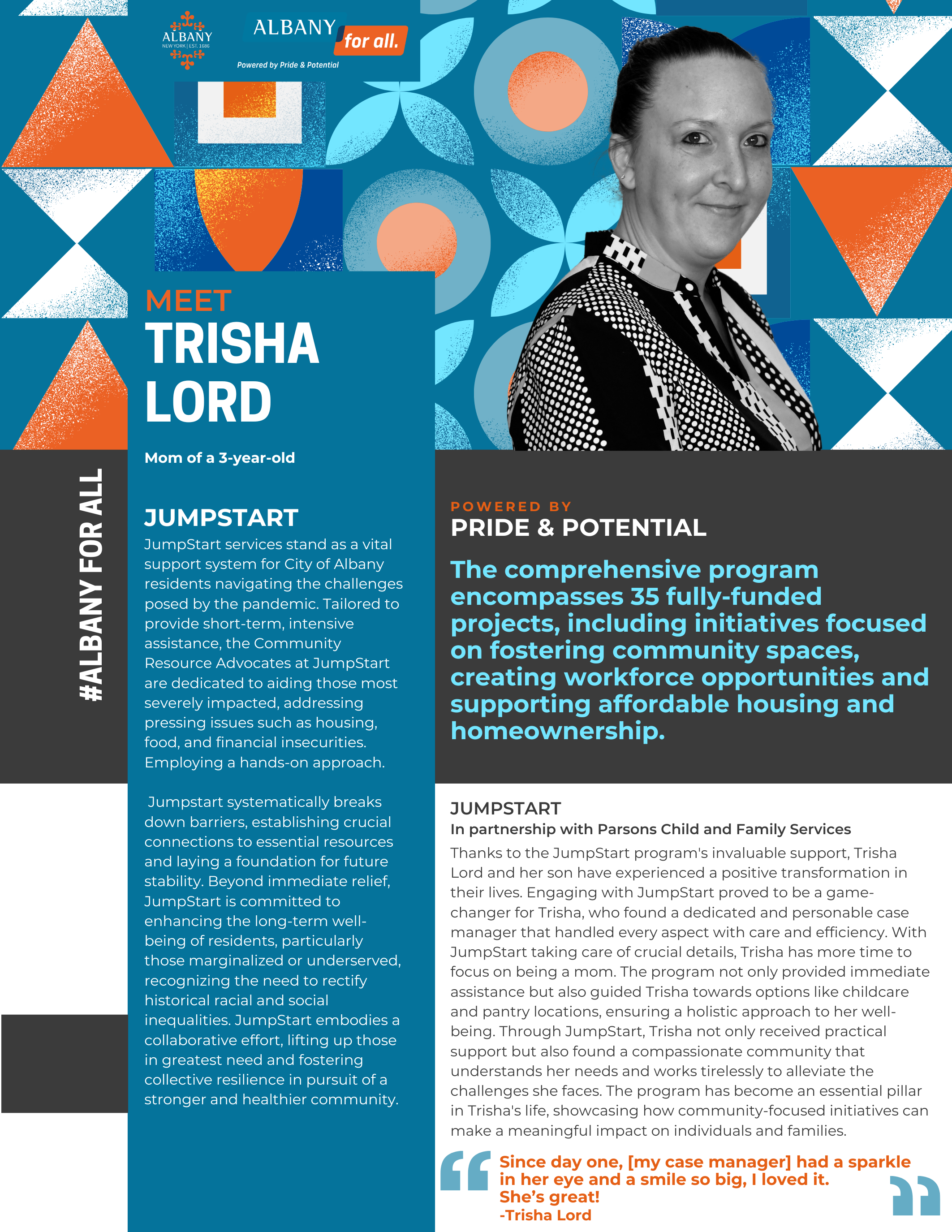
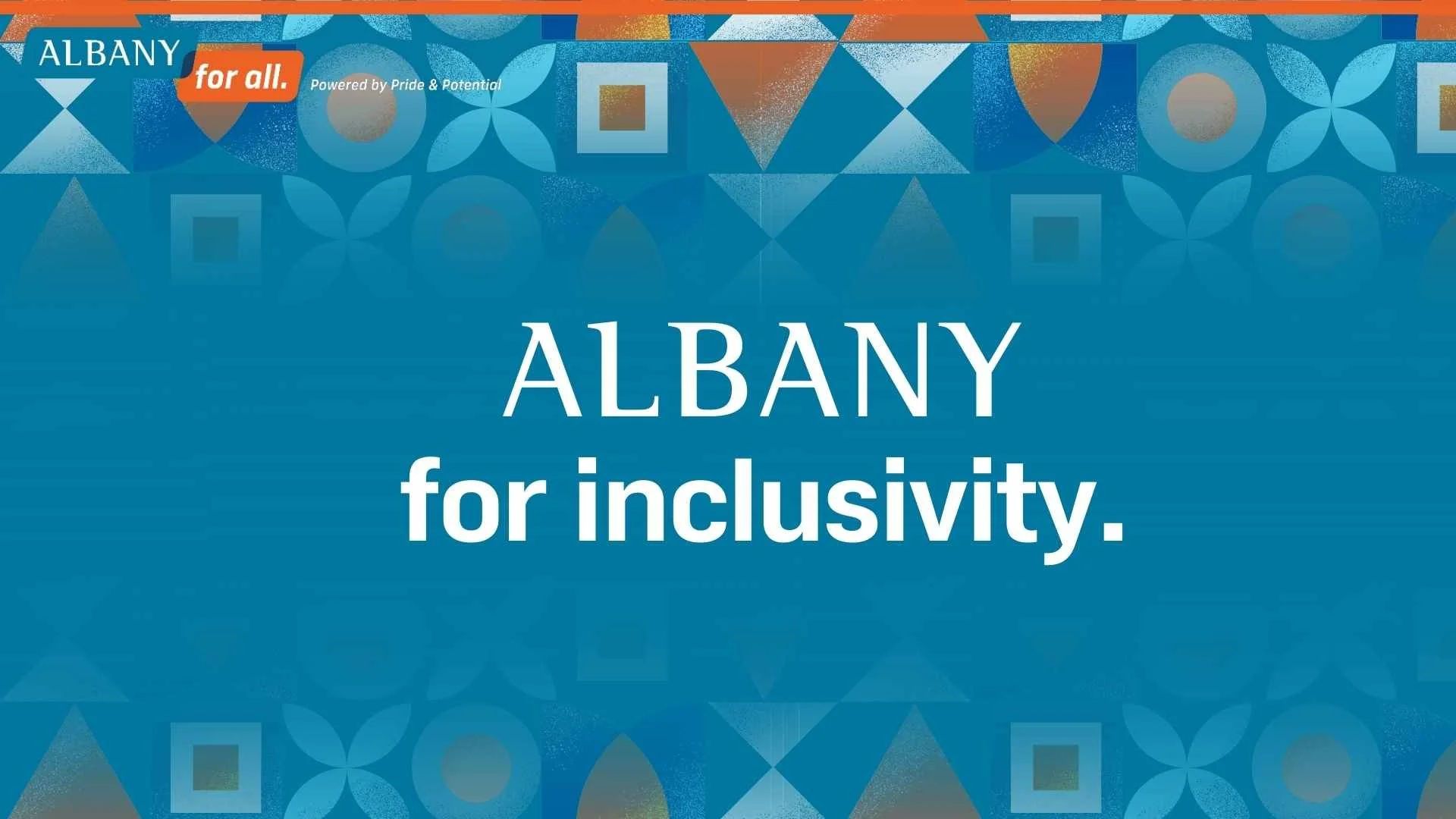
Albany For Inclusivity

Albany For Homeownership
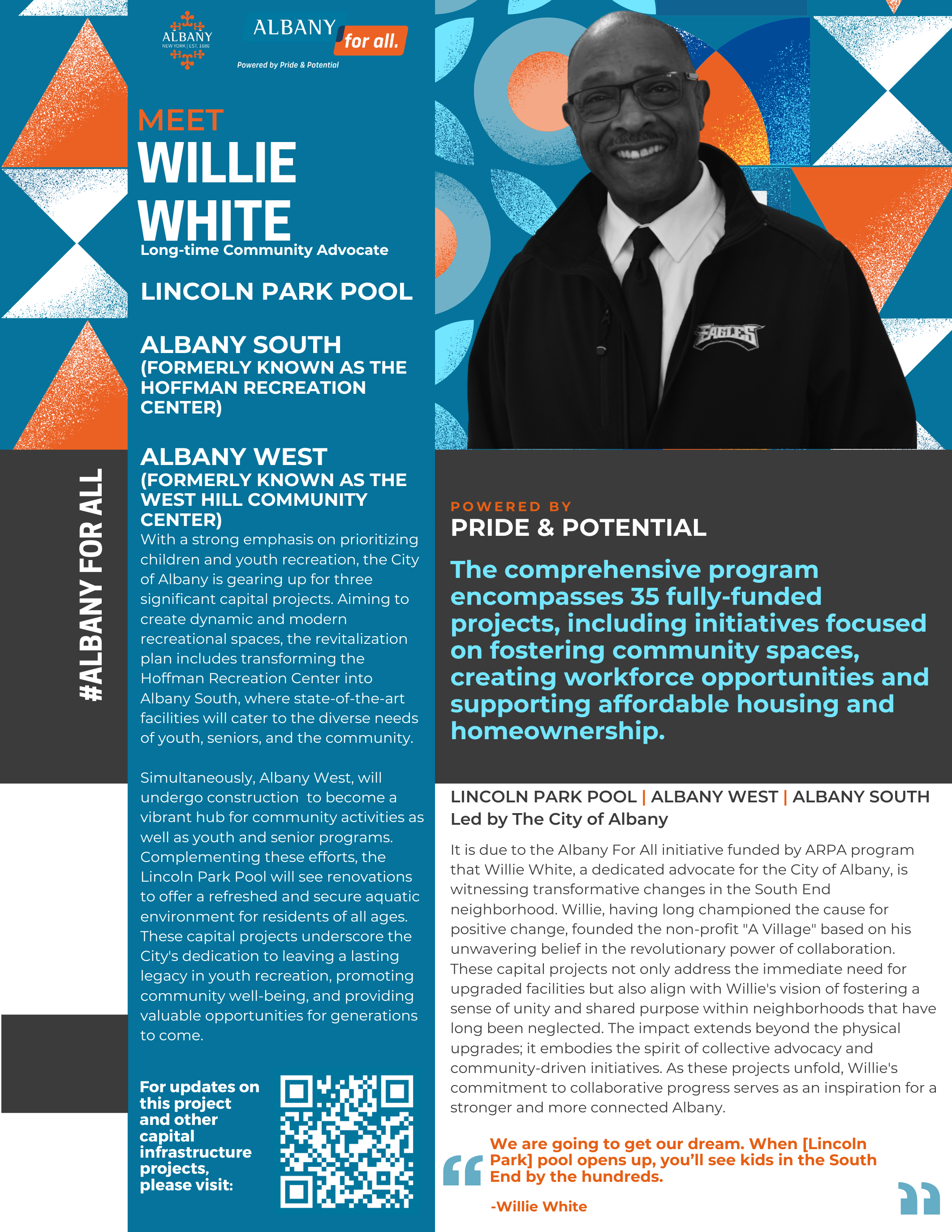
Albany For Recreation
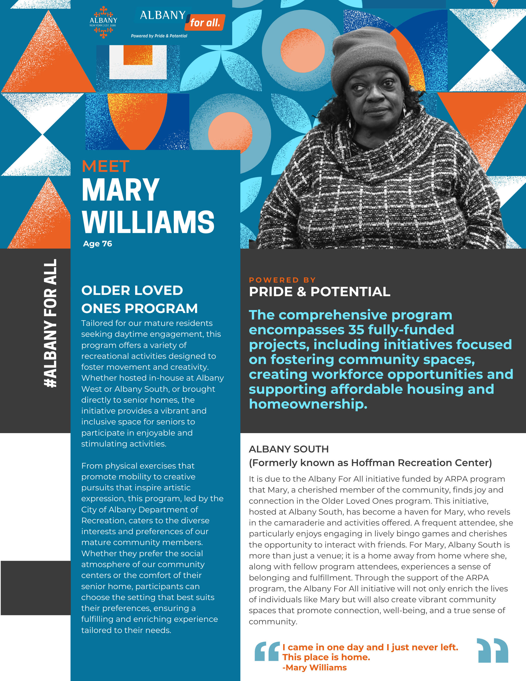
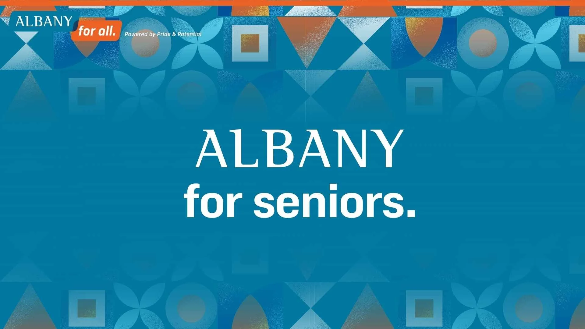
Albany For Seniors
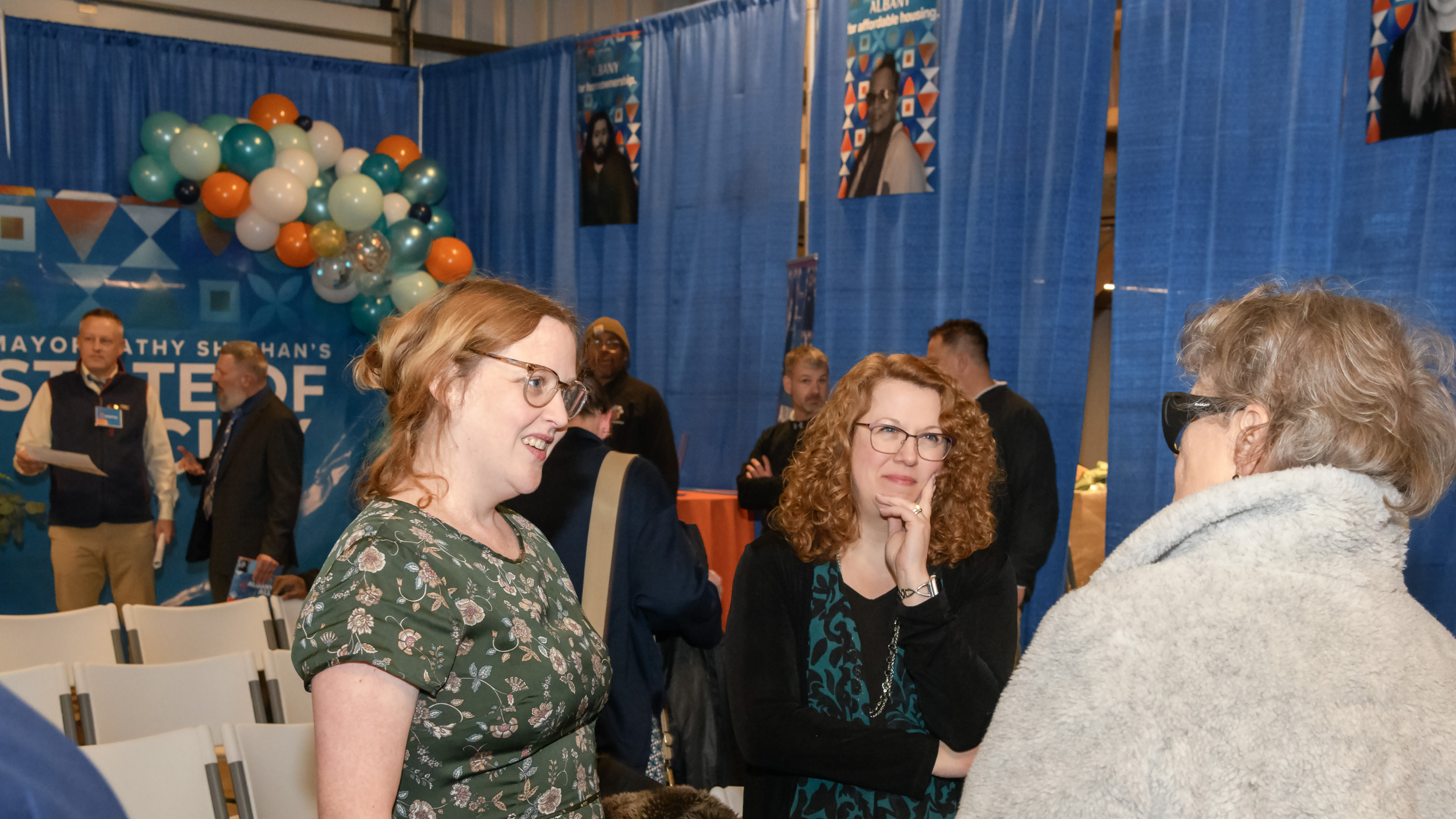
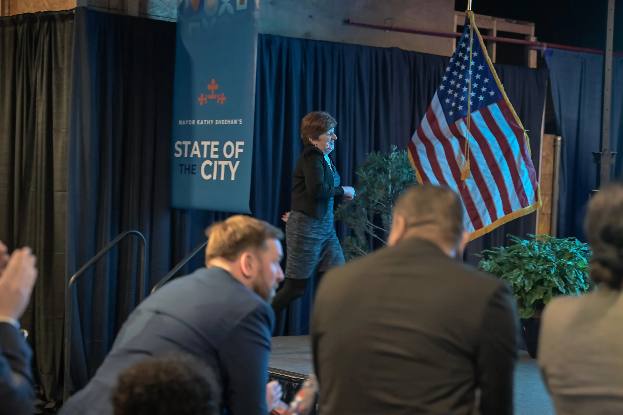
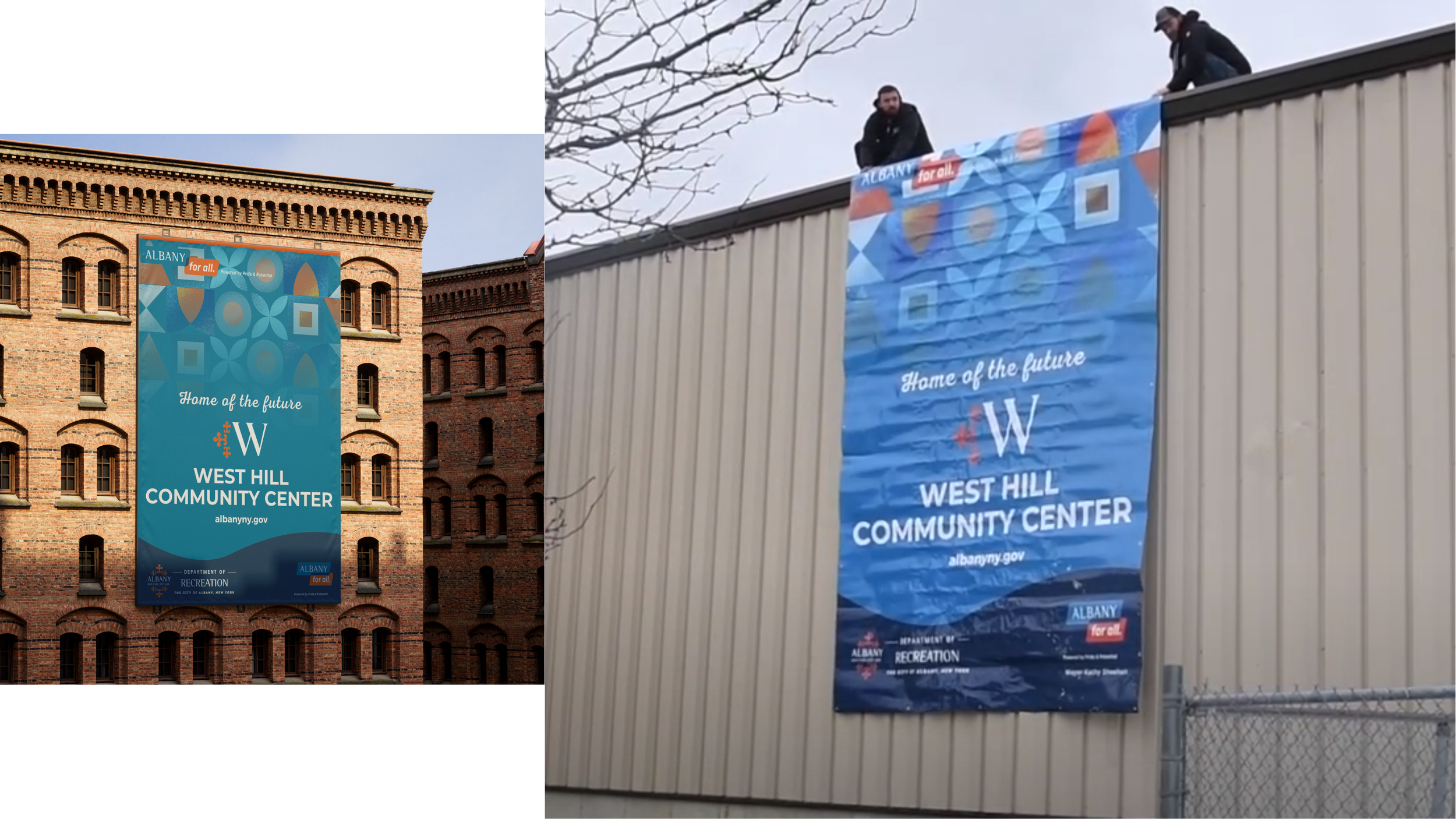
Environmental Graphics
I extended the SOTC 2024 system into the venue itself with:
Hanging ceiling signage
Building-level signage and wayfinding
These pieces turned a large event space into a branded environment, reinforcing the theme from the moment people walked in.


Video Moments
I created visual direction for the video content that supported the address — including interview framing and story beats that matched the static portrait series and slide language.
The goal: every medium — print, web, slides, or video — felt like part of one continuous narrative.
The Pattern Behind it All
A visual language about working together
The repeating motif behind the portraits and slides wasn’t just decorative.
As said by Mayor Kathy Sheehan, herself, the pattern represents:
“the intricate nature of the community working together… the power of people coming together to create something meaningful… the collaborative effort required for progress.” PORTFOLIO SOTC 24
That’s what this State of the City was designed to show — not just accomplishments, but the people and partnerships that made them possible.