

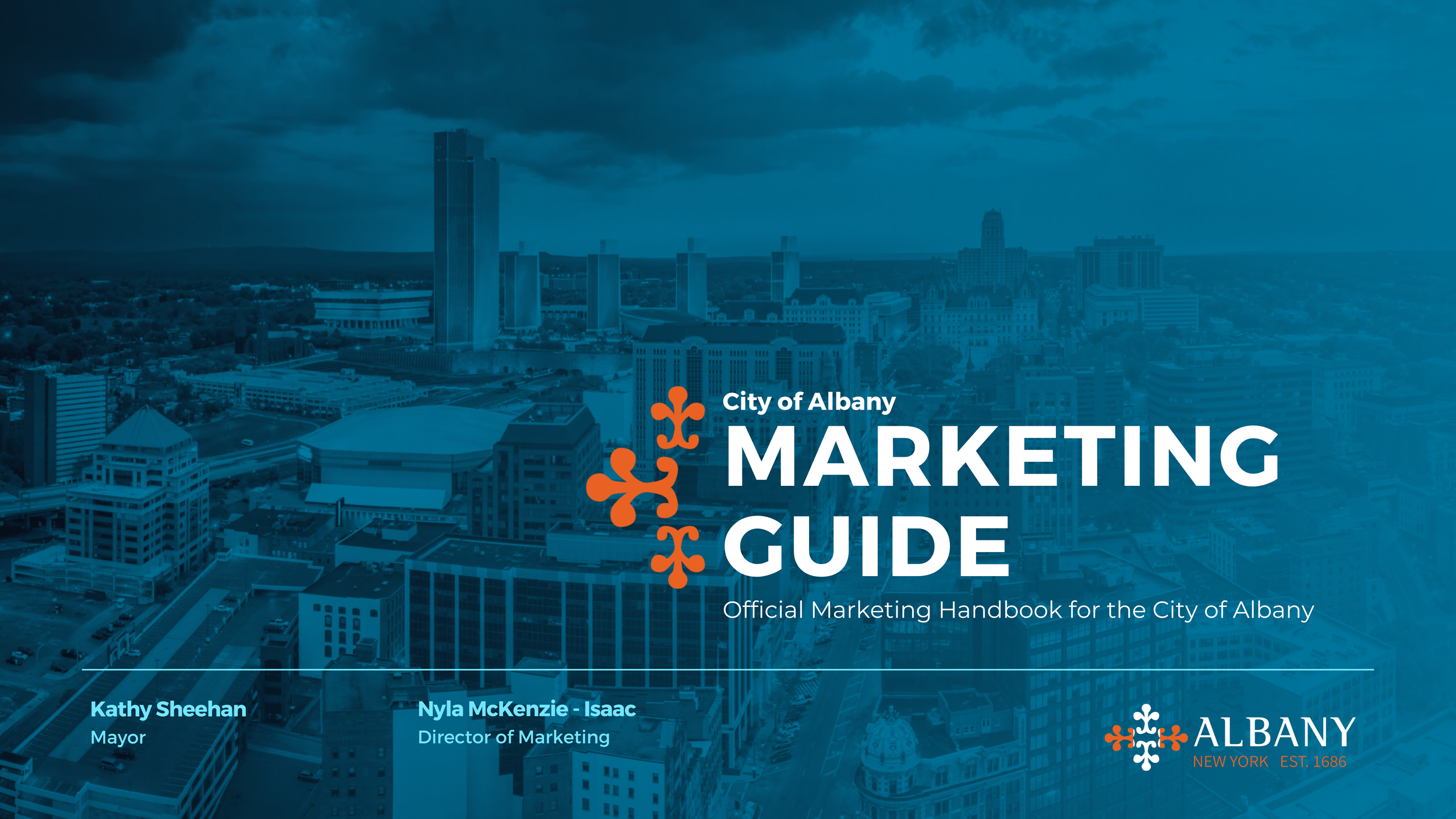
Unifying a City’s Voice:
Albany’s Integrated Brand System
How I turned 22+ siloed City departments and offices into one cohesive civic brand:
I built the first cohesive, citywide brand system for the City of Albany, unifying more than 22 departments and offices under a single, recognizable visual and storytelling framework.
Through intentional design, strategic alignment, and cross-department collaboration, I transformed disconnected communication into a unified civic identity, one that is clear, consistent, and distinctly Albany. I transformed a static logo into a living, citywide identity.
This wasn’t just a campaign.
It was the foundation of a new way for a city to speak.
Snapshot.
CLIENT
City of Albany, NY
ROLE
First Director of Marketing
SCOPE
22+ Departments & Offices
AUDIENCE
100K Residents
FOCUS
Citywide Brand System & Integration

In 2018…
the Office of Innovation completed a survey and presentation of the various brand concepts being used by City departments. It was clear that the current logo was outdated and there was no consistent brand identity or coherent city message.
In 2020,

When the City of Albany introduced a new logo in 2020, it signaled a fresh vision — but there was no structure behind its use. Without centralized direction, each department interpreted the mark independently, resulting in inconsistent visuals and fragmented communication across the City.
In the laws of marketing, a logo is not the beginning of a brand, it is the byproduct of one. Identity is shaped by meaning, consistency, and experience first. The symbol simply becomes the visual summary of everything that already exists. A symbol had been created. I built the brand behind it and the framework needed to sustain it.
The City did not lack creativity. It lacked structure:
Disconnected messaging
Inconsistent design
Confusion for residents
Redundant efforts between departments
No clear sense of what “Albany” looked or felt like
The Nyla Effect
I designed the system, the voice, and the identity the logo had been waiting for — creating the strategy, structure, and tools that allowed the brand to live cohesively across every department and platform.
My objective wasn’t to limit creativity, it was to unify it.
I envisioned a flexible system that allowed every department to maintain its voice while contributing to a shared, recognizable identity. A brand that was adaptable, but unmistakable. Structured, but not stiff.
This meant developing:
• A unified visual language
• A clear messaging framework
• Scalable marketing tools
• An integrated creative process
• Cross-department collaboration
What had once been “willy-nilly” became intentional.
Albany was no longer scattered ; it had a voice.
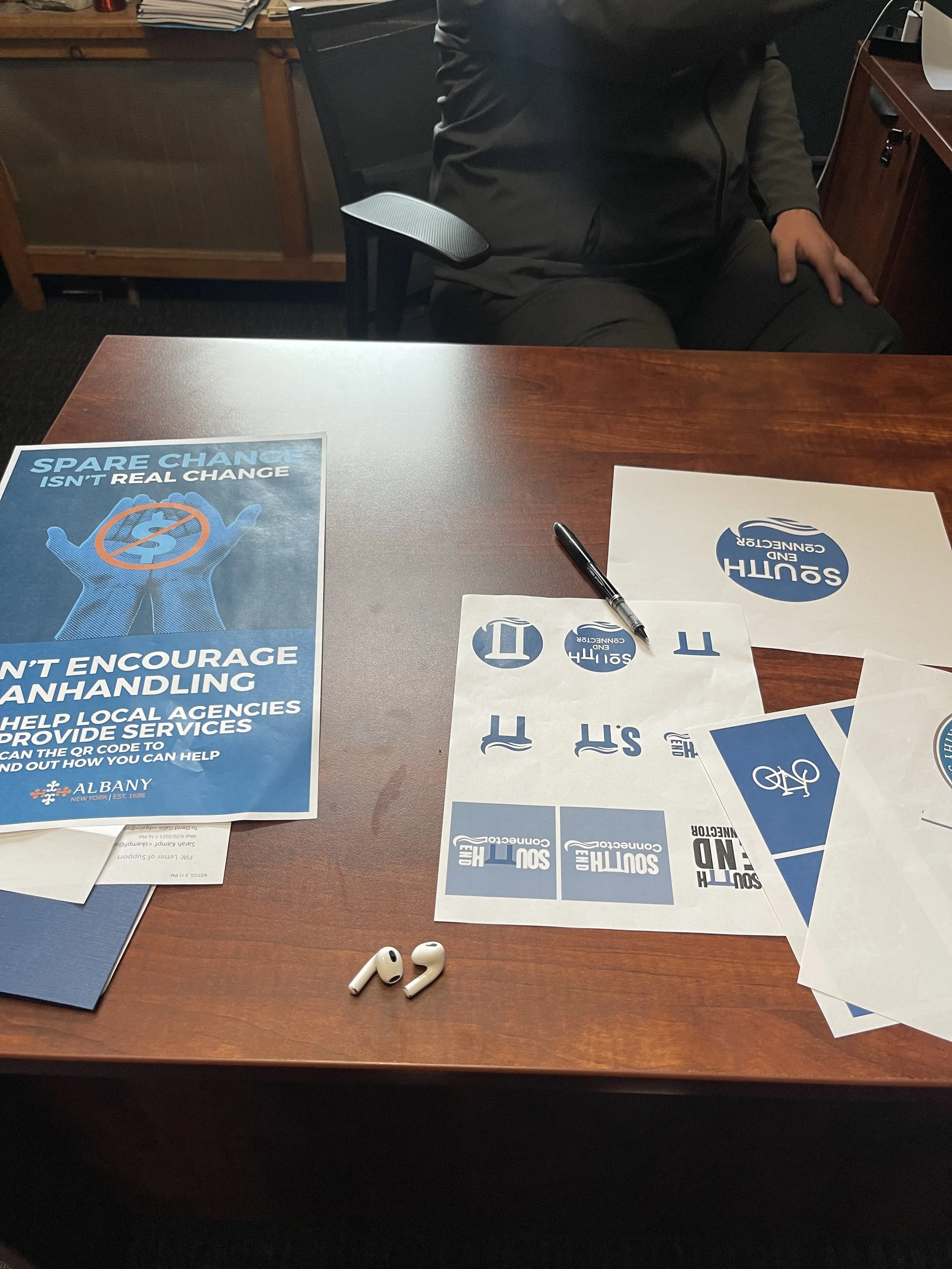
Audit | Research & Discovery
I gathered and reviewed existing materials from over 22 departments — social posts, newsletters, flyers, websites, presentations, and signage. This audit revealed gaps, overlaps, and opportunities for alignment.
Build | System Creation
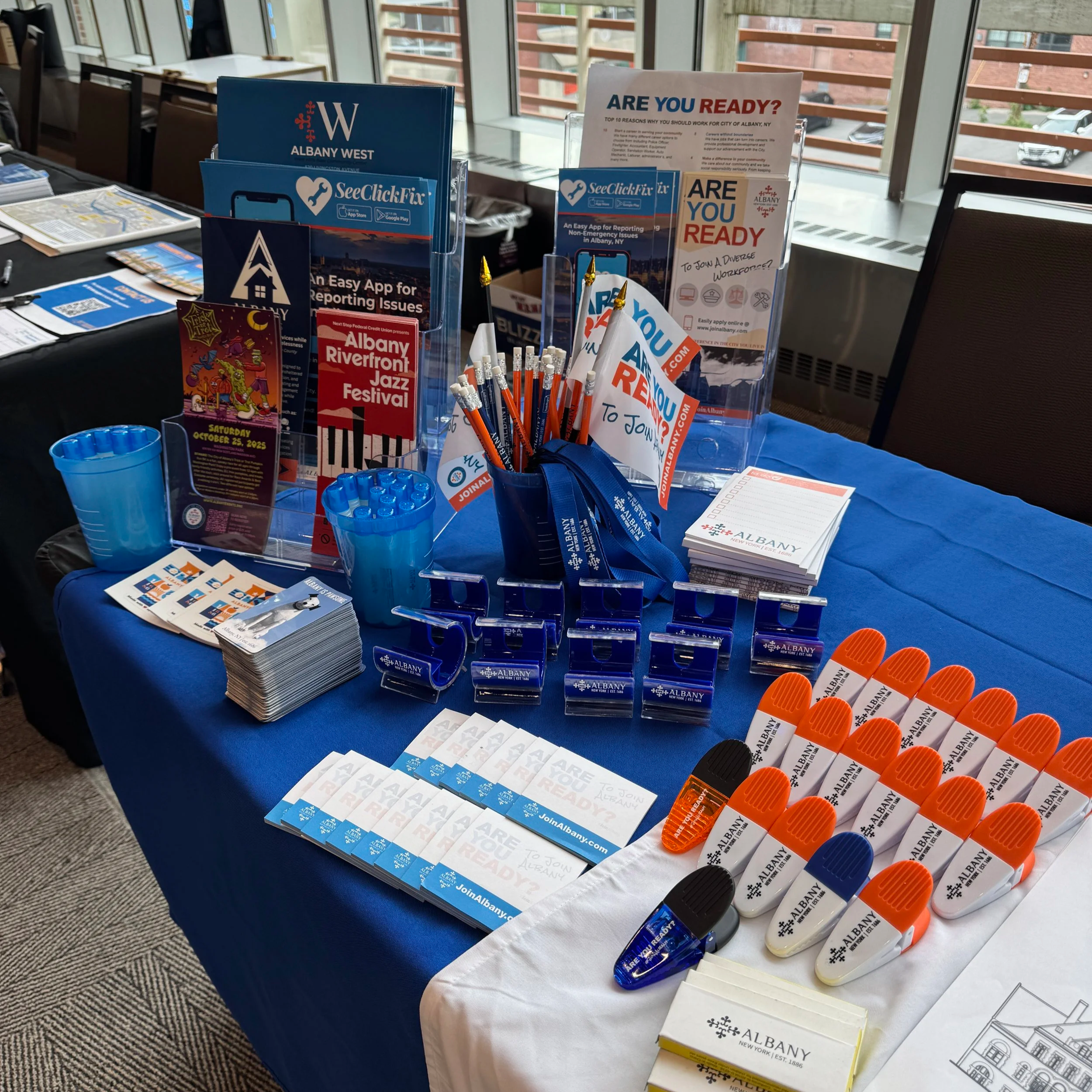
I designed a flexible, citywide brand structure that could be used across departments, campaigns, and platforms.
Included:
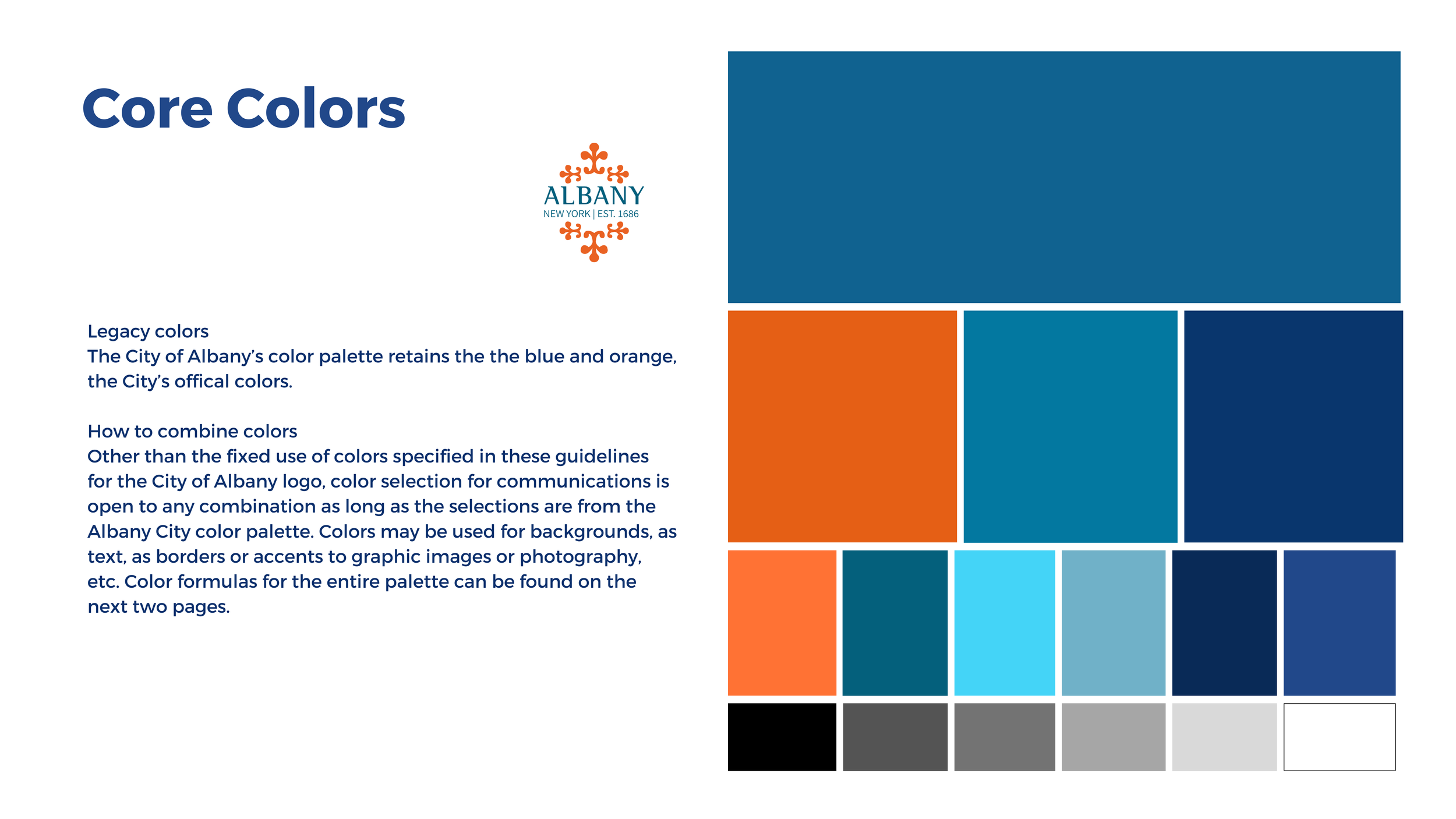
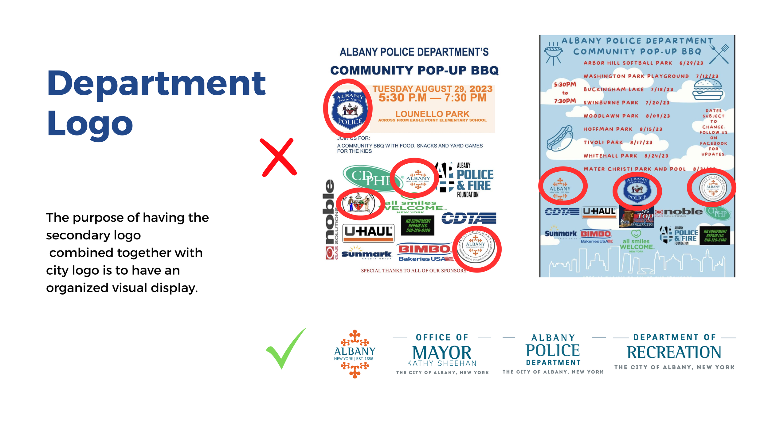
– Color & type systems
– Social + print templates
– Messaging guidance
– Content structure & hierarchy
– Visual standards

Integrate | Implementation & Alignment
I worked directly with internal teams to introduce the system, provide creative direction, and guide their interpretation of the brand.
This wasn’t just delivery, it was education, collaboration, and culture change.
The System at Work.
Once implemented, the system allowed Albany’s messaging to feel unified across all areas of civic life.
Whether residents saw a post, a poster, a banner, or a presentation, they now recognized it as one voice, one city.
In most municipal environments, marketing is not a dedicated role, it is an added responsibility layered onto people who were not formally trained in it. That reality shaped my approach.
A critical part of my work was ensuring that anyone tasked with marketing, regardless of background, was equipped with the right tools, templates, guidance, and systems to execute confidently and consistently. I designed for the real world: limited time, limited training, and very real responsibilities.
This is why the system had to be clear, intuitive, and sustainable.
Not just beautiful — but usable.


The Shift.
This work didn’t just improve how Albany looked — it transformed how Albany communicates.
A scattered, multi-voiced presence became a cohesive, recognizable identity.
Disconnected messaging turned into intentional storytelling.
What once felt fragmented now moved in alignment.
The results:
A unified brand presence across 22+ departments
Clearer, more intentional communication with residents
Increased internal efficiency and collaboration
Stronger public recognition and visual consistency
More strategic planning and execution across campaigns
A foundation designed to outlive any single administration
In bringing structure to complexity, the work began to bridge divides that had long existed between:
Design and strategy
Government and community
Process and emotion
Policy and people
What remained wasn’t just a new look — it was a living framework. One that strengthened trust, clarity, and identity across an entire city.
Tatiana Diaz, Director of Human Resources, City of Albany
Praised for “single-handedly transforming how the City approaches marketing”
